
Change the colors of your whole site by chatting
Colors decide the first impression of a site. Many designs start out black, white and grey, which is clean but can feel cold for a café, a studio or a shop. In WordPress you would open the Site Editor, find Styles, edit the palette and then fix each element by hand. In ShipPress you describe the colors you want in the chat and the AI changes the whole site at once. In this tutorial I give Pier 7 Coffee a warm harbor palette: cream, deep navy and copper.
-
Look at your current colors first
Open your site in ShipPress and scroll the preview to a part with buttons, links and small labels. On Pier 7 Coffee everything is white, black and grey: the page background, the labels on the coffee cards and the links. Decide what feeling you want and where each color should go.
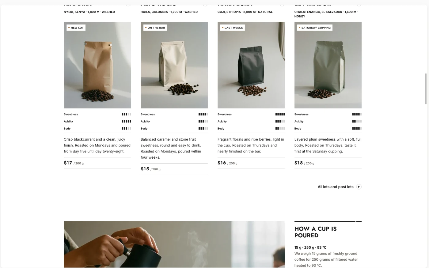
Before: a clean but plain black-and-white site. -
Describe the palette in one message
Type in the chat what you want and where each color goes. You do not need color codes. Words like “soft cream”, “deep navy” and “copper” are enough. Also say what must stay the same, for example that all text stays easy to read. I sent:
Give the whole site a warm harbor color palette: a soft cream page background, deep navy for the header, footer and dark sections, and a copper accent for buttons, links and the small labels on the coffee cards. Keep all text easy to read.
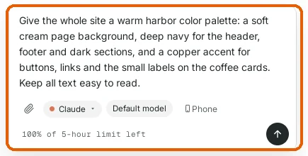
Name the colors in plain words and say where each one goes. -
Let the AI change the colors
Press Enter. The AI explains what it will do, then updates the design's color palette, which controls the header, footer, dark sections, buttons and links on every page. On Pier 7 Coffee it took about a minute and a half. You can keep typing while it works; new messages wait until it is done.
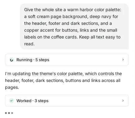
The AI changes the site-wide palette, not one page at a time. -
Read what changed
When it is done, the AI lists each change: the page background, the header and footer, the buttons and links, the coffee card labels and the text color. It also tells you how it kept the text readable, for example cream text on copper buttons.
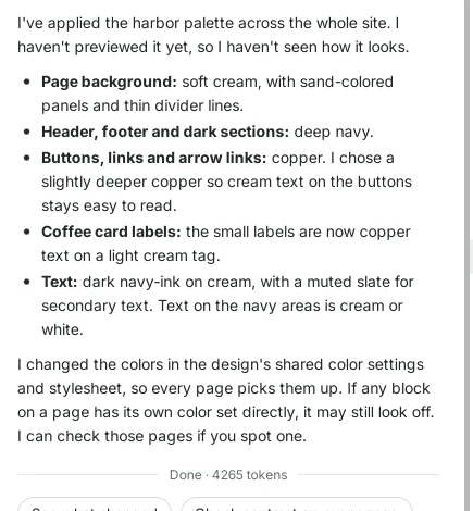
A short list of every color it changed. -
Compare before and after
Click Refresh above the preview and scroll to the same place. The page now has a warm cream background and the labels on the coffee cards and the “All lots and past lots” link are copper. Scroll to the bottom: the footer is deep navy with cream text.
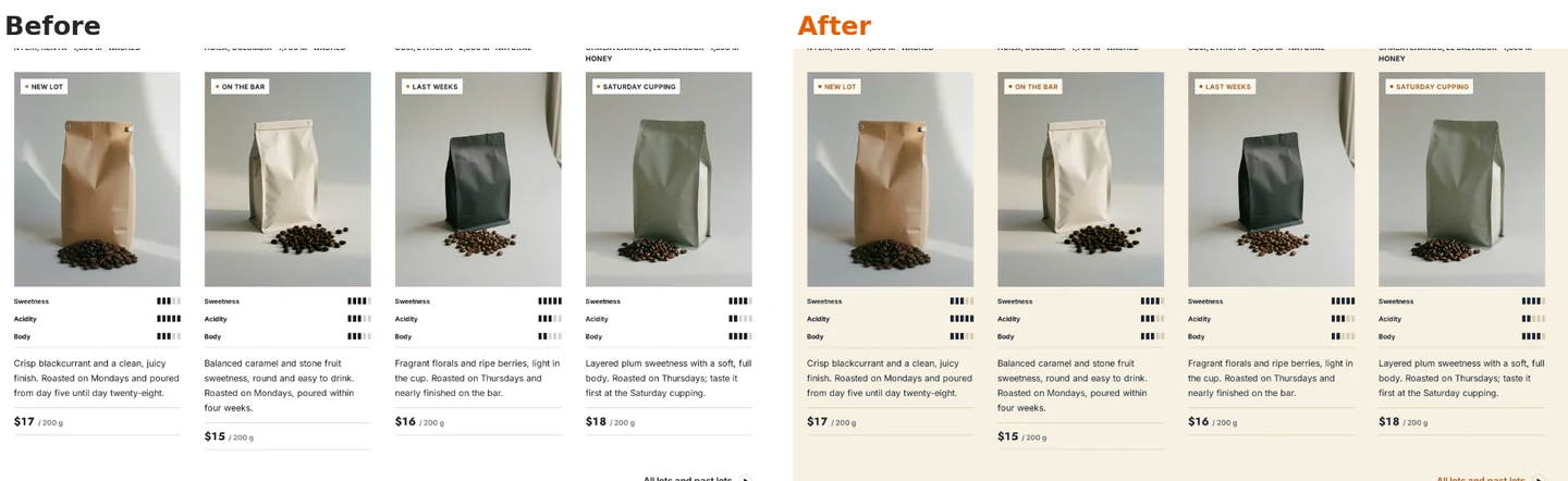
Same section, new palette. 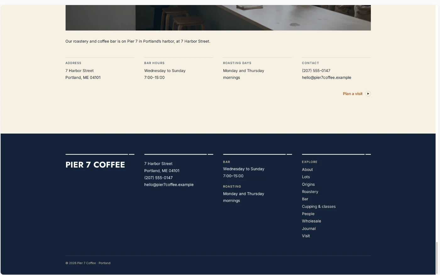
The footer and dark sections use the deep navy. -
Fine-tune with a short follow-up
Not quite right? Say it in a few words. Under the answer ShipPress suggests next steps; I clicked Make the copper a bit lighter. The AI made the copper warmer and brighter and explained why it did not go further: lighter copper would make the cream text on the buttons harder to read. If you change your mind, Undo this change is right there.
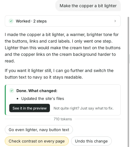
Small changes take one short message and a few seconds. -
Check it on Phone
Click Phone at the top right of the preview and scroll through the page. The colors are set for the whole site, so the phone layout uses the same cream background, copper labels and navy headings.
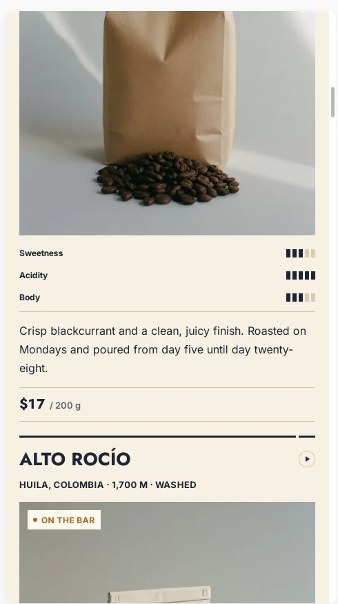
The new colors on a phone-sized screen. -
See the palette in Colors and fonts
Want to see or adjust the colors yourself? Click Colors and fonts above the preview. It opens WordPress's Styles panel for the whole site. Under Colors you see the new palette and the colors for Link, Captions, Button and Heading. You can change any of them by hand there, but you never have to.
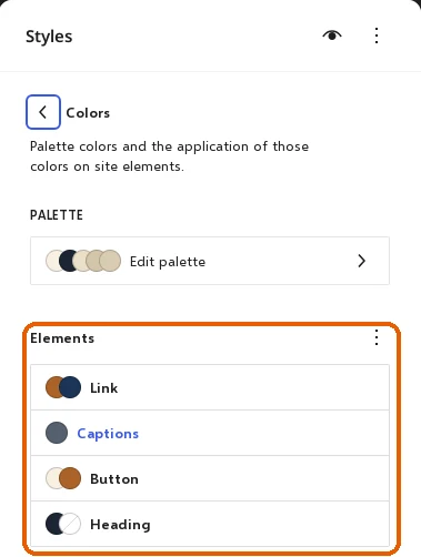
The AI's palette is a normal WordPress palette you can edit. -
Go back any time with History
ShipPress saves a restore point after every AI turn. Click History at the top right to see one for the new palette and one for the lighter copper. Click Restore next to any of them to go back to exactly how the site looked at that moment.
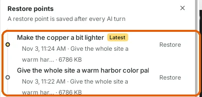
Every color change can be undone. -
Tips
- Three colors are usually enough: a background, a dark color for headers and text, and one accent for buttons and links.
- Say where each color goes, not only which colors you like.
- Ask the AI to keep text easy to read; it will pick a slightly darker or lighter shade if needed.
- Photos keep their own colors. Pick a palette that fits them.
- Check a few pages and Phone before you click Go live.