
Check your site on Computer, Laptop, Tablet and Phone
Most visitors will see your site on a phone, not on the big screen you build it on. The ShipPress preview can show your site at four widths with one click. In this tutorial I check Pier 7 Coffee on all four sizes, find a small problem in the phone menu, and ask the AI to fix it.
-
Find the four sizes in the preview bar
Open your site. At the top right of the preview there are four buttons: Computer, Laptop, Tablet and Phone. Hover one to see its width:
- Computer: 1920 px, a large desktop screen.
- Laptop: 1280 px.
- Tablet: 1024 px.
- Phone: 480 px.
The page is drawn at that real width. If it doesn't fit your window, ShipPress shrinks it to fit, so you always see the whole width. ShipPress remembers the size you picked for each site.
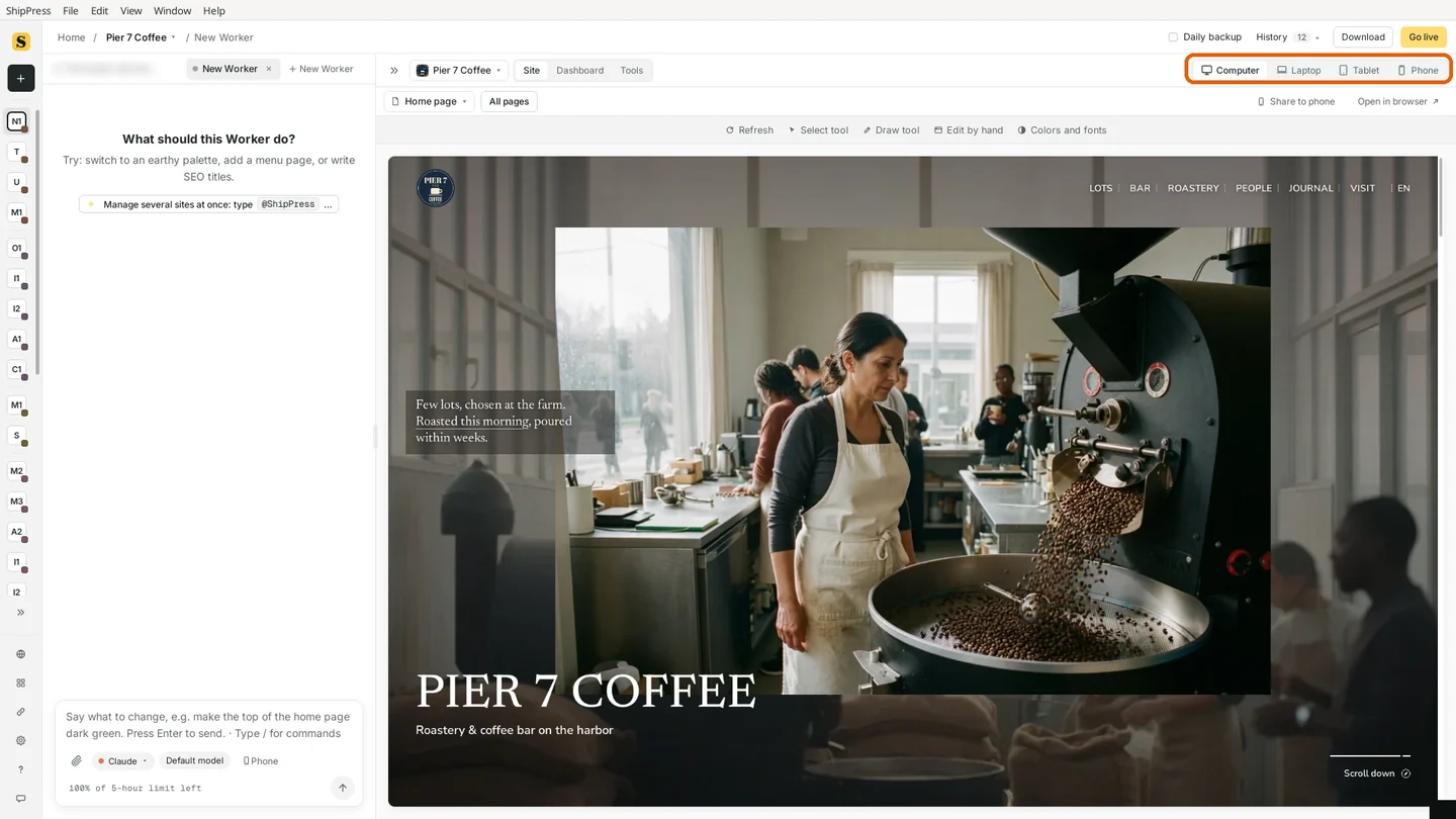
The four sizes sit at the top right of the preview. Computer is on here. -
Laptop: the most common size for desktop visitors
Click Laptop. Many people browse on a 13 or 14 inch laptop, so this is a good everyday check. Look at the menu at the top and the large headings: on Pier 7 Coffee the layout stays the same, just a little tighter, and the menu still fits on one line.
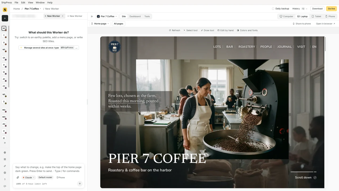
Laptop (1280 px): same layout, a little tighter. -
Tablet: check rows of columns and wide images
Click Tablet. This is where rows of three or four columns, long menus and wide photos start to get tight. Scroll down the whole page, not just the top: sections further down are where text squeezes or a picture gets cut off first.
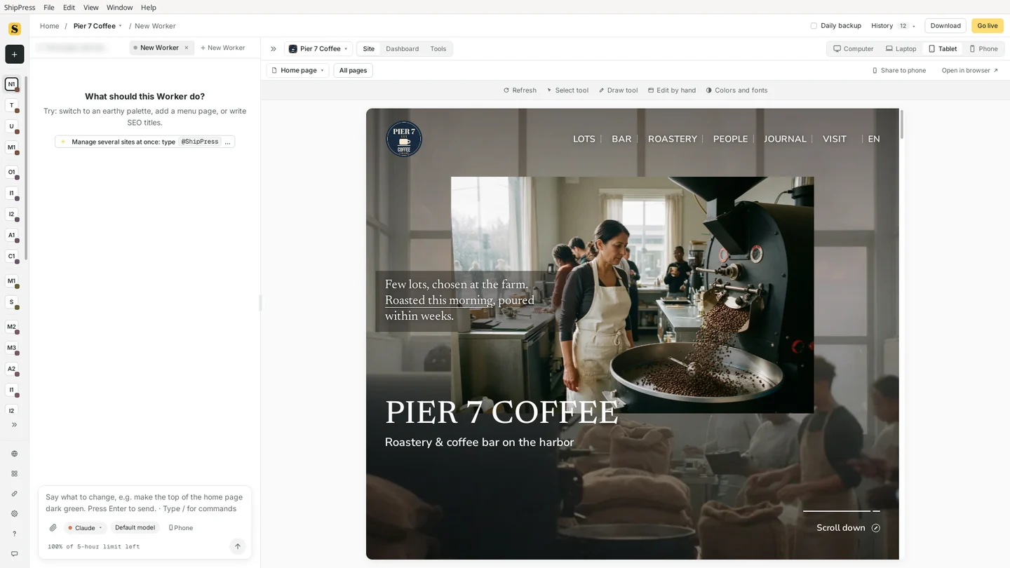
Tablet (1024 px): the menu still fits, the photo is cropped tighter. -
Phone: open the menu and go through each page
Click Phone. Now the site looks the way most visitors will see it. On Pier 7 Coffee the top menu turns into a MENU button and the photo and title stack on top of each other.
Don't stop at the home page. Use the page menu at the top left of the preview (it shows the page you're on, like Home page) to go to your other pages, and on each one:
- open the menu and close it again,
- scroll to the bottom,
- check prices, tables and buttons are easy to read and tap.
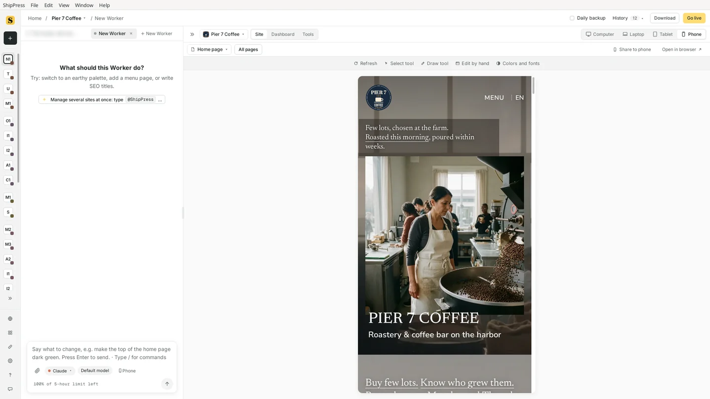
Phone (480 px): the menu becomes a MENU button and the content stacks. 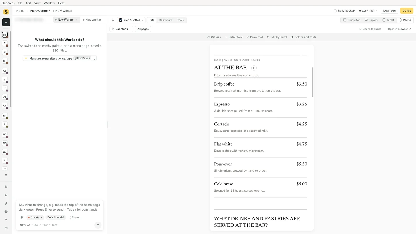
The Bar Menu page on a phone: the price list reads fine in one column. -
Spot what looks off
Small problems are easy to miss on a big screen. When I opened the menu in the Phone size, its top right corner had two close buttons: a large × and a tiny extra ×. It still works, but it looks unfinished, and you only see it on a phone.
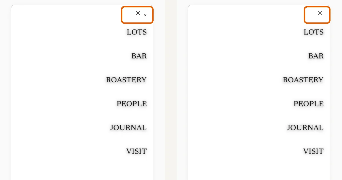
Left: the phone menu with two close buttons. Right: after the fix in the next step. -
Tell the AI what you see, and on which size
Describe the problem in the chat in plain words and say on which size it happens. Also say what should stay as it is. I wrote:
“On phones, when I open the menu there are two close (x) buttons in the top right corner. Please keep just one, and leave the computer layout as it is.”
While the Worker works, the preview shows The AI is changing your site…. You can keep typing; new messages go next. After a minute or two the Worker explained what it found (the theme drew a second × on top of the menu's own icon), removed the extra one, and said the change only affects the open phone menu.
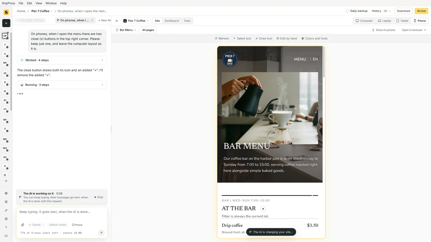
The request in the chat. The preview stays on Phone while the AI works. 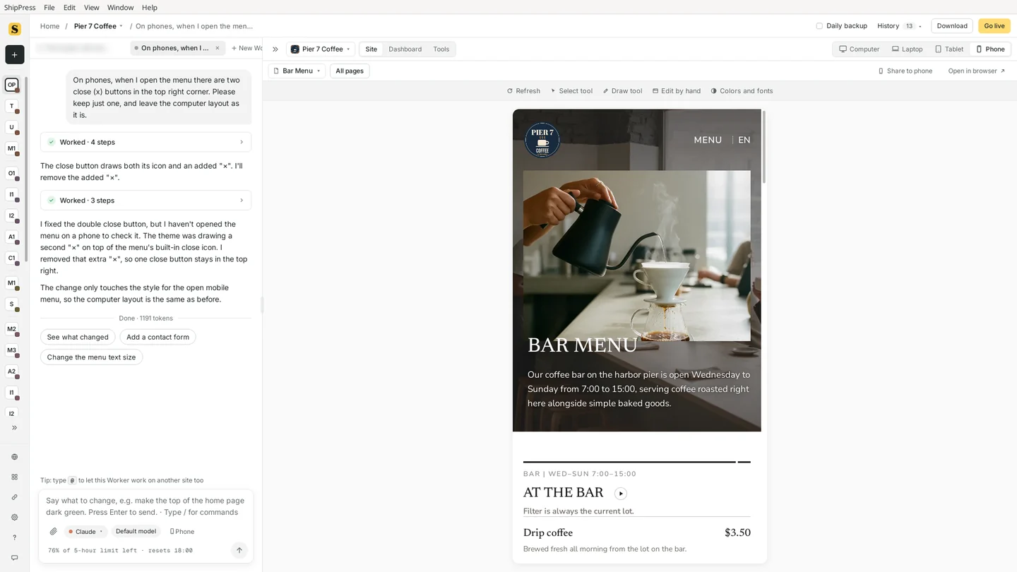
The Worker's answer, with suggestions for what to do next. -
Check again on Phone, then on Computer
The AI can't always look at the screen itself, so check the result yourself. Stay on Phone and open the menu again: now there is one close button (the right side of the before and after picture above). Then click Computer and make sure the big screen still looks the same. If you don't like a change, open History at the top and go back to the version before it.
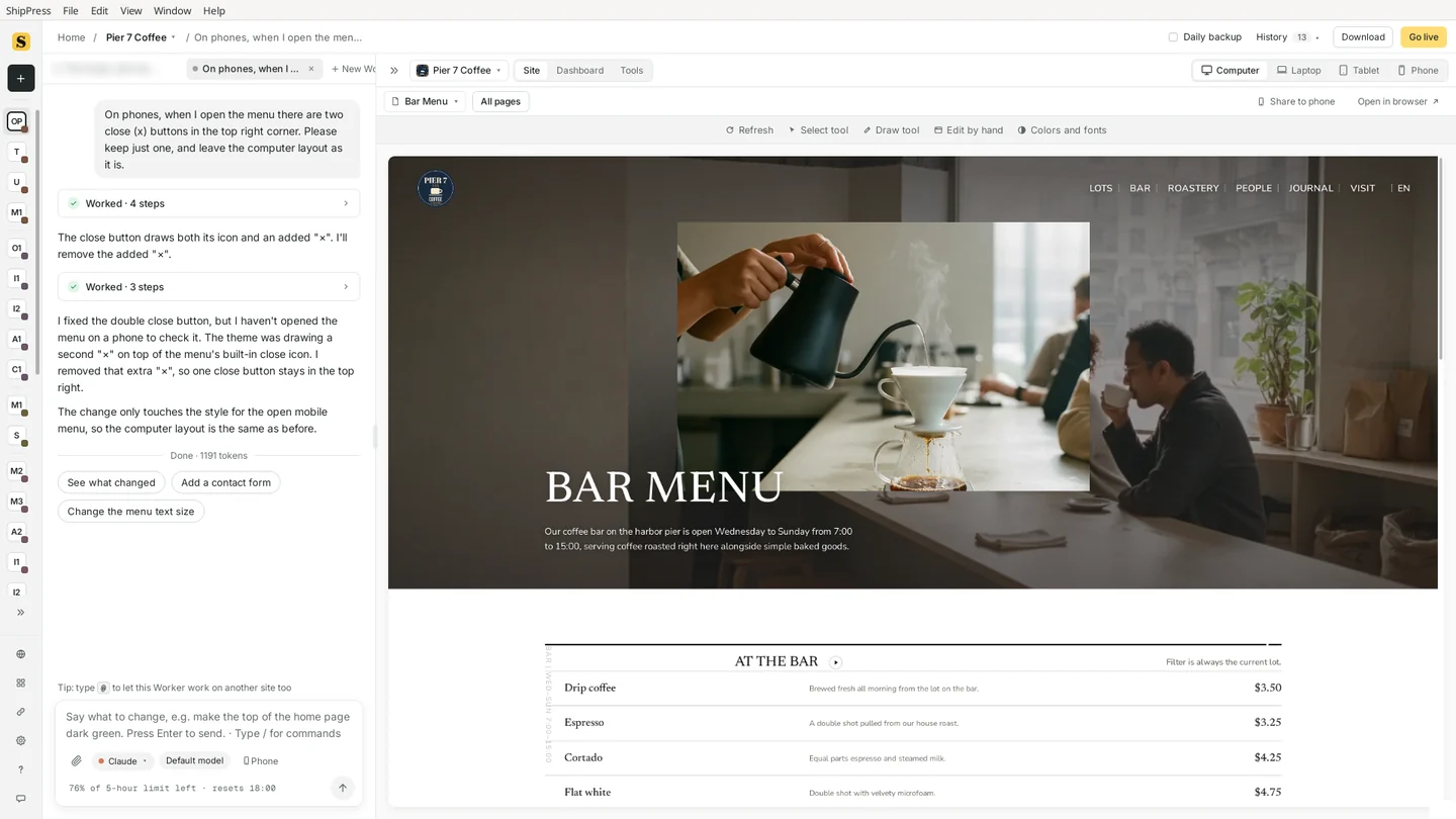
Back on Computer: the desktop layout didn't change. -
Tips
- Check every page on Phone before you go live, and again after big changes such as a new design.
- Name the size in your message (“on phones”, “on tablets”), so the AI changes only that size.
- To try the site in a real browser window, use Open in browser at the top right of the preview. To see it on your own phone, use Share to phone.
- If something is fine on Phone but looks off on Tablet, say so: the in-between sizes are the ones designs get wrong most often.